



The only agent that thinks for itself

Autonomous Monitoring with self-learning AI built-in, operating independently across your entire stack.

Unlimited Metrics & Logs
Machine learning & MCP
5% CPU, 150MB RAM
3GB disk, >1 year retention
800+ integrations, zero config
Dashboards, alerts out of the box
> Discover Netdata Agents

Centralized metrics streaming and storage

Aggregate metrics from multiple agents into centralized Parent nodes for unified monitoring across your infrastructure.

Stream from unlimited agents
Long-term data retention
High availability clustering
Data replication & backup
Scalable architecture
Enterprise-grade security
> Learn about Parents

Fully managed cloud platform

Access your monitoring data from anywhere with our SaaS platform. No infrastructure to manage, automatic updates, and global availability.

Zero infrastructure management
99.9% uptime SLA
Global data centers
Automatic updates & patches
Enterprise SSO & RBAC
SOC2 & ISO certified
> Explore Netdata Cloud

Deploy Netdata Cloud in your infrastructure

Run the full Netdata Cloud platform on-premises for complete data sovereignty and compliance with your security policies.

Complete data sovereignty
Air-gapped deployment
Custom compliance controls
Private network integration
Dedicated support team
Kubernetes & Docker support
> Learn about Cloud On-Premises

Powerful, intuitive monitoring interface

Modern, responsive UI built for real-time troubleshooting with customizable dashboards and advanced visualization capabilities.

Real-time chart updates
Customizable dashboards
Dark & light themes
Advanced filtering & search
Responsive on all devices
Collaboration features
> Explore Netdata UI

Monitor on the go

Native iOS and Android apps bring full monitoring capabilities to your mobile device with real-time alerts and notifications.

iOS & Android apps
Push notifications
Touch-optimized interface
Offline data access
Biometric authentication
Widget support
> Download apps

The future of infrastructure observability

See our strategic direction across AI-native observability, full-stack signals, operational intelligence, and enterprise platform maturity.

AI-native observability
Full-stack signal coverage
Operational intelligence
Enterprise platform maturity
Agent releases every 6 weeks
Cloud continuous delivery
> Explore Product Roadmap

Best energy efficiency

True real-time per-second

100% automated zero config

Centralized observability

Multi-year retention

High availability built-in

Zero maintenance

Always up-to-date

Enterprise security

Complete data control

Air-gap ready

Compliance certified

Millisecond responsiveness

Infinite zoom & pan

Works on any device

Native performance

Instant alerts

Monitor anywhere

AI-native observability

Continuous delivery

Open source foundation

80% Faster Incident Resolution

AI-powered troubleshooting from detection, to root cause and blast radius identification, to reporting.

True Real-Time and Simple, even at Scale

Linearly and infinitely scalable full-stack observability, that can be deployed even mid-crisis.

90% Cost Reduction, Full Fidelity

Instead of centralizing the data, Netdata distributes the code, eliminating pipelines and complexity.

See and Map Your Entire Network

Live topology, flow analytics, and SNMP device and trap monitoring — unified with your full-stack observability.

Control Without Surrender

SOC 2 Type 2 certified with every metric kept on your infrastructure.

Integrations

800+ collectors and notification channels, auto-discovered and ready out of the box.

800+ data collectors
Auto-discovery & zero config
Cloud, infra, app protocols
Notifications out of the box
> Explore integrations
Real Results
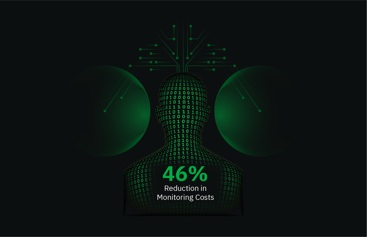
46% Cost Reduction

Reduced monitoring costs by 46% while cutting staff overhead by 67%.

— Leonardo Antunez, Codyas

Zero Pipeline

No data shipping. No central storage costs. Query at the edge.

From Our Users
"Out-of-the-Box"

So many out-of-the-box features! I mostly don't have to develop anything.

— Simon Beginn, LANCOM Systems

No Query Language

Point-and-click troubleshooting. No PromQL, no LogQL, no learning curve.

Enterprise Ready
67% Less Staff, 46% Cost Cut

Enterprise efficiency without enterprise complexity—real ROI from day one.

— Leonardo Antunez, Codyas

SOC 2 Type 2 Certified

Zero data egress. Only metadata reaches the cloud. Your metrics stay on your infrastructure.

Full Coverage
800+ Collectors

Auto-discovered and configured. No manual setup required.

Any Notification Channel

Slack, PagerDuty, Teams, email, webhooks—all built-in.

Built for the People Who Get Paged

Because 3am alerts deserve instant answers, not hour-long hunts.

Every Industry Has Rules. We Master Them.

See how healthcare, finance, and government teams cut monitoring costs 90% while staying audit-ready.

Monitor Any Technology. Configure Nothing.

Install the agent. It already knows your stack.
From Our Users
"A Rare Unicorn"

Netdata gives more than you invest in it. A rare unicorn that obeys the Pareto rule.

— Eduard Porquet Mateu, TMB Barcelona

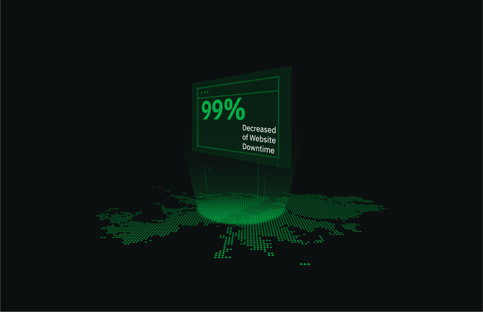
99% Downtime Reduction

Reduced website downtime by 99% and cloud bill by 30% using Netdata alerts.

— Falkland Islands Government

Real Savings
30% Cloud Cost Reduction

Optimized resource allocation based on Netdata alerts cut cloud spending by 30%.

— Falkland Islands Government

46% Cost Cut

Reduced monitoring staff by 67% while cutting operational costs by 46%.

— Codyas

Real Coverage
"Plugin for Everything"

Netdata has agent capacity or a plugin for everything, including Windows and Kubernetes.

— Eduard Porquet Mateu, TMB Barcelona

"Out-of-the-Box"

So many out-of-the-box features! I mostly don't have to develop anything.

— Simon Beginn, LANCOM Systems

Real Speed
Troubleshooting in 30 Seconds

From 2-3 minutes to 30 seconds—instant visibility into any node issue.

— Matthew Artist, Nodecraft

20% Downtime Reduction

20% less downtime and 40% budget optimization from out-of-the-box monitoring.

— Simon Beginn, LANCOM Systems

Pay per Node. Unlimited Everything Else.

One price per node. Unlimited metrics, logs, users, and retention. No per-GB surprises.

Free tier—forever
No metric limits or caps
Retention you control
Cancel anytime
> See pricing plans

What's Your Monitoring Really Costing You?

Most teams overpay by 40-60%. Let's find out why.

Expose hidden metric charges
Calculate tool consolidation
Customers report 30-67% savings
Results in under 60 seconds
> See what you're really paying

Your Infrastructure Is Unique. Let's Talk.

Because monitoring 10 nodes is different from monitoring 10,000.

On-prem & air-gapped deployment
Volume pricing & agreements
Architecture review for your scale
Compliance & security support
> Start a conversation

Monitoring That Sells Itself

Deploy in minutes. Impress clients in hours. Earn recurring revenue for years.

30-second live demos close deals
Zero config = zero support burden
Competitive margins & deal protection
Response in 48 hours
> Apply to partner

Per-Second Metrics at Homelab Prices

Same engine, same dashboards, same ML. Just priced for tinkerers.

Community: Free forever · 5 nodes · non-commercial
Homelab: $90/yr · unlimited nodes · fair usage
> Get the Homelab Plan

$1,000 Per Referral. Unlimited Referrals.

Your colleagues get 10% off. You get 10% commission. Everyone wins.

10% of subscriptions, up to $1,000 each
Track earnings inside Netdata Cloud
PayPal/Venmo payouts in 3-4 weeks
No caps, no complexity
> Get your referral link
Cost Proof
40% Budget Optimization

"Netdata's significant positive impact" — LANCOM Systems

Calculate Your Savings

Compare vs Datadog, Grafana, Dynatrace

Savings Proof
46% Cost Reduction

"Cut costs by 46%, staff by 67%" — Codyas

30% Cloud Bill Savings

"Reduced cloud bill by 30%" — Falkland Islands Gov

Enterprise Proof
"Better Than Combined Alternatives"

"Better observability with Netdata than combining other tools." — TMB Barcelona

Real Engineers, <24h Response

DPA, SLAs, on-prem, volume pricing

Why Partners Win
Demo Live Infrastructure

One command, 30 seconds, real data—no sandbox needed

Zero Tickets, High Margins

Auto-config + per-node pricing = predictable profit

Homelab Ready
Free Video Course

8-episode Netdata tutorial by LearnLinux.tv

76k+ GitHub Stars

3rd most starred monitoring project

Worth Recommending
Product That Delivers

Customers report 40-67% cost cuts, 99% downtime reduction

Zero Risk to Your Rep

Free tier lets them try before they buy

AI Support Assistant, Available 24/7

Nedi has access to all official documentation, source code, and resources. Ask any question about Netdata—responds in your language.

Deployment & configuration
Troubleshooting & sizing
Alerts & notifications
Evidence-based answers
> Ask Nedi now

Never Fight Fires Alone

Docs, community, and expert help—pick your path to resolution.

Learn.netdata.cloud docs
Discord, Forums, GitHub
Premium support available
> Get answers now

60 Seconds to First Dashboard

One command to install. Zero config. 850+ integrations documented.

Linux, Windows, K8s, Docker
Auto-discovers your stack
> Read our documentation

76,000+ Engineers Strong

615+ contributors. 1.5M daily downloads. One mission: simplify observability.

Per-Second. 90% Cheaper. Data Stays Home.

Side-by-side comparisons: costs, real-time granularity, and data sovereignty for every major tool.

See why teams switch from Datadog, Prometheus, Grafana, and more.

> Browse all comparisons
Edge-Native Observability, Born Open Source
Per-second visibility, ML on every metric, and data that never leaves your infrastructure.
Founded in 2016
615+ contributors worldwide
Remote-first, engineering-driven
Open source first
> Read our story
Promises We Publish—and Prove
12 principles backed by open code, independent validation, and measurable outcomes.
Open source, peer-reviewed
Zero config, instant value
Data sovereignty by design
Aligned pricing, no surprises
> See all 12 principles
Edge-Native, AI-Ready, 100% Open
76k+ stars. Full ML, AI, and automation—GPLv3+, not premium add-ons.
76,000+ GitHub stars
GPLv3+ licensed forever
ML on every metric, included
Zero vendor lock-in
> Explore our open source
Build Real-Time Observability for the World
Remote-first team shipping per-second monitoring with ML on every metric.
Remote-first, fully distributed
Open source (76k+ stars)
Challenging technical problems
Your code on millions of systems
> See open roles
Meet the Team Behind Netdata
Conferences, meetups, and tradeshows where you can see Netdata in action and talk to the engineers who build it.
Live demos and deep dives
Book 1-on-1 meetings
Talks and panel sessions
Event recaps and photos
> See all events
Talk to a Netdata Human in <24 Hours
Sales, partnerships, press, or professional services—real engineers, fast answers.
Discuss your observability needs
Pricing and volume discounts
Partnership opportunities
Media and press inquiries
> Book a conversation
Your Data. Your Rules.
On-prem data, cloud control plane, transparent terms.
Trust & Scale
76,000+ GitHub Stars

One of the most popular open-source monitoring projects

SOC 2 Type 2 Certified

Enterprise-grade security and compliance

Data Sovereignty

Your metrics stay on your infrastructure

Validated
University of Amsterdam

"Most energy-efficient monitoring solution" — ICSOC 2023, peer-reviewed

ADASTEC (Autonomous Driving)

"Doesn't miss alerts—mission-critical trust for safety software"

Community Stats
615+ Contributors

Global community improving monitoring for everyone

1.5M+ Downloads/Day

Trusted by teams worldwide

GPLv3+ Licensed

Free forever, fully open source agent

Why Join?
Remote-First

Work from anywhere, async-friendly culture

Impact at Scale

Your work helps millions of systems

Observability

Real-Time Data Visualization: Examples & Use Cases

Turning Streaming Data into Actionable Insights Instantly
by Netdata Team · April 15, 2025

Data is increasingly generated at an unprecedented velocity. From application logs and system metrics to user interactions and IoT sensor readings, the sheer volume can be overwhelming. Simply collecting this data isn’t enough; the real value lies in understanding it as it happens. This is where real-time data visualization comes into play. It transforms relentless streams of raw data into clear, intuitive visuals, allowing you to grasp trends, spot anomalies, and make informed decisions instantly.

For developers, DevOps engineers, and SREs managing complex systems, the ability to see performance metrics, error rates, or resource utilization live is not just helpful – it’s often critical. Static reports showing yesterday’s problems are insufficient when you need to react to issues now. This guide explores the fundamentals of live data visualization, its key benefits, common use cases, and the best practices for creating effective real time dashboards.

What is Real-Time Data Visualization?

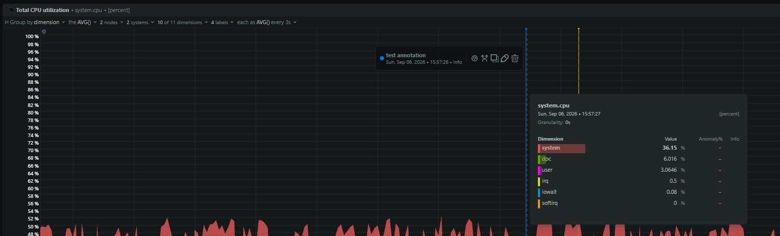
Real-time data visualization is the process of representing data graphically the moment it is generated or processed, with minimal delay (typically milliseconds to seconds). Unlike traditional static charts or reports that show historical snapshots, real time visualization updates dynamically, providing a live feed of what’s happening right now.

It’s more than just plotting points on a graph; it relies on underlying real-time analytics pipelines that ingest, filter, aggregate, and enrich streaming data very quickly. The goal is to present this fresh, processed data through interactive dashboards, charts, maps, and other visual elements, allowing users to monitor conditions, detect patterns, and analyze trends as they unfold. This immediacy enables faster responses and more proactive management of systems and processes.

Key Benefits of Real-Time Data Visualization

Adopting real-time data visualization offers significant advantages for individuals and organizations across various domains:

Enhanced Decision-Making

Seeing up-to-the-minute data allows you to react swiftly to changing conditions. Whether it’s identifying a sudden spike in server load, noticing a drop in conversion rates, or detecting a potential security threat, real-time visuals provide the context needed for immediate, data-driven decisions, rather than relying on outdated information or intuition.

Improved Understanding & Insight Discovery

Our brains process visual information far more quickly than raw numbers or text. Well-designed visualizations make complex datasets understandable at a glance. Real-time updates help you spot trends, correlations, and outliers as they emerge – patterns that might be easily missed in static reports or spreadsheets.

Better Operational Awareness

Real time dashboards provide a holistic view of ongoing operations. For SREs, this could mean monitoring application performance, infrastructure health, and user experience simultaneously. For business leaders, it might involve tracking sales figures, production line output, and supply chain movements live. This comprehensive awareness supports better management and coordination.

Proactive Problem Solving

Instead of waiting for alerts triggered by lagging indicators or analyzing post-mortem reports, real-time visualization allows you to see issues developing as they happen. A gradually increasing error rate or slowly degrading response time becomes immediately apparent, enabling intervention before a minor issue escalates into a major outage or problem.

Streamlined Data Analysis & Time Savings

Automating the presentation of live data eliminates the need for manual data compilation, report generation, and constant requests for updates. Teams can spend less time gathering data and more time interpreting it and taking action, significantly improving efficiency.

Improved Performance Monitoring

Continuously tracking key performance indicators (KPIs) visually makes it easy to understand system health, application responsiveness, network throughput, or any other critical metric. This is fundamental for performance tuning and ensuring service level objectives (SLOs) are met.

Better Customer Analysis/Experience

Businesses can track customer behavior, sentiment on social media, or interaction patterns in real time. This enables personalized responses, quicker support, and adjustments to marketing or product strategies based on immediate feedback and trends.

Common Use Cases Across Industries

The power of seeing data live is leveraged across numerous fields:

IT Operations & Monitoring

This is a core area for DevOps and SREs. Real-time dashboards are essential for monitoring:

Finance & Trading

The financial world relies heavily on real-time data for:

  • Tracking stock prices, currency exchange rates, and market indices.
  • Algorithmic trading decisions based on live market movements.
  • Real-time fraud detection by analyzing transaction patterns.
  • Risk management and portfolio monitoring.

E-commerce & Sales Management

Especially crucial during peak periods like holidays or promotions:

  • Monitoring website traffic, conversion rates, and revenue in real time.
  • Tracking inventory levels and adjusting pricing dynamically.
  • Analyzing the immediate impact of marketing campaigns.
  • Visualizing sales performance by region, product, or team.

Manufacturing & IoT

The Industrial Internet of Things (IIoT) generates vast amounts of sensor data:

  • Monitoring production line efficiency, machine health (temperature, vibration), and potential bottlenecks.
  • Visualizing real-time IoT data for quality control and predictive maintenance.
  • Tracking assets and managing supply chains live.
  • Monitoring environmental conditions within facilities.

Healthcare

  • Live monitoring of patient vital signs (heart rate, blood pressure, oxygen saturation).
  • Tracking hospital bed availability and resource allocation.
  • Analyzing disease outbreak patterns in real time.

Network Security

Crisis Management

  • Tracking the spread of natural disasters or public health crises.
  • Monitoring social media feeds and news reports during emergencies.
  • Coordinating response efforts based on live situational awareness.

Building Effective Real-Time Dashboards

Creating a dashboard that effectively visualizes real-time data involves more than just picking a few charts. Key considerations include:

Defining Goals and Audience

Start by asking:

  • Who is this dashboard for (e.g., SREs, developers, managers, customers)?
  • What specific questions does it need to answer?
  • What key metrics are most important for this audience?
  • What decisions will they make based on this data? A dashboard designed for monitoring infrastructure health will look very different from one tracking sales conversions.

Choosing the Right Visualizations

Different data types and goals call for different visual representations:

  • Line charts: Excellent for showing trends over time (e.g., CPU usage, request latency).
  • Bar charts: Good for comparing discrete values (e.g., error counts by service).
  • Gauges/Single Stats: Ideal for displaying current key metrics against thresholds (e.g., current user count, SLO compliance).
  • Heatmaps: Useful for visualizing density or distribution over time or categories (e.g., request latency distribution).
  • Maps (Geospatial): For data tied to physical locations (e.g., server locations, user traffic origins).
  • Scatter plots: To show relationships between two variables. Select chart types that tell the data’s story clearly and accurately. Avoid overly complex visuals.

Underlying Data Infrastructure

Real-time dashboards are only as good as the data pipelines feeding them. This requires:

  • Low-latency data ingestion: Technologies like Kafka, AWS Kinesis, or native collectors to capture data quickly.
  • Fast processing/analytics: Databases optimized for real-time queries and aggregations (e.g., time-series databases like InfluxDB, Druid, or real-time analytics platforms).
  • Efficient data models: Well-structured data that supports fast filtering, aggregation, and enrichment.

Key Dashboard Functionality

Effective dashboards are often interactive:

  • Filtering: Allowing users to drill down into specific time ranges, services, regions, or other dimensions.
  • Aggregating: Summarizing data (e.g., sum, average, count, percentile) over time or categories.
  • Enriching: Combining data from multiple sources (e.g., joining metrics with metadata) for richer context. The performance of these interactions depends heavily on the underlying infrastructure and query efficiency.

Best Practices for Real-Time Data Visualization

To maximize the effectiveness of your real-time visualizations, follow these best practices:

  • Know Your Goal and Audience: Tailor the content, complexity, and visuals to the specific needs of the user.
  • Choose the Right Visuals: Select chart types appropriate for the data and the message you want to convey. Don’t use a pie chart for time-series data!
  • Keep it Simple and Clean: Avoid clutter. Use clear labels, consistent colors, and adequate white space. Focus on presenting the most critical information clearly. Less is often more.
  • Ensure Data Accuracy and Freshness: The credibility of the dashboard depends on reliable, up-to-date data. Monitor the health of your data pipelines.
  • Prioritize Performance: Dashboards must load quickly and update smoothly. Optimize database queries, use appropriate aggregation strategies (pre-aggregation where possible), and choose performant infrastructure. Avoid common pitfalls like inefficient queries or aggregating massive datasets at query time.
  • Implement Security and Privacy: If visualizing sensitive data, ensure robust access controls, encryption, and compliance with privacy regulations.
  • Ensure Accessibility: Design dashboards considering users with disabilities (e.g., sufficient color contrast, keyboard navigation support, text alternatives) following guidelines like WCAG.
  • Use Predictable Layouts: Arrange elements logically and consistently across dashboards to make them intuitive and easy to navigate.

Real-time data visualization transforms abstract streams of data into immediate, actionable understanding. For DevOps, SREs, and anyone managing dynamic systems or processes, the ability to see what’s happening right now is invaluable. It enables faster troubleshooting, proactive maintenance, better performance tuning, and more informed decision-making, moving beyond reactive problem-solving to proactive system management.

By understanding the benefits, exploring relevant use cases, and following design best practices, you can create powerful real-time dashboards that provide crucial insights. The key lies in combining meaningful visualizations with performant, reliable real-time data infrastructure. Effective monitoring tools are the foundation for achieving this visibility.

Ready to experience the power of real-time visualization for your own systems? Explore Netdata for high-fidelity, real-time monitoring and troubleshooting dashboards.