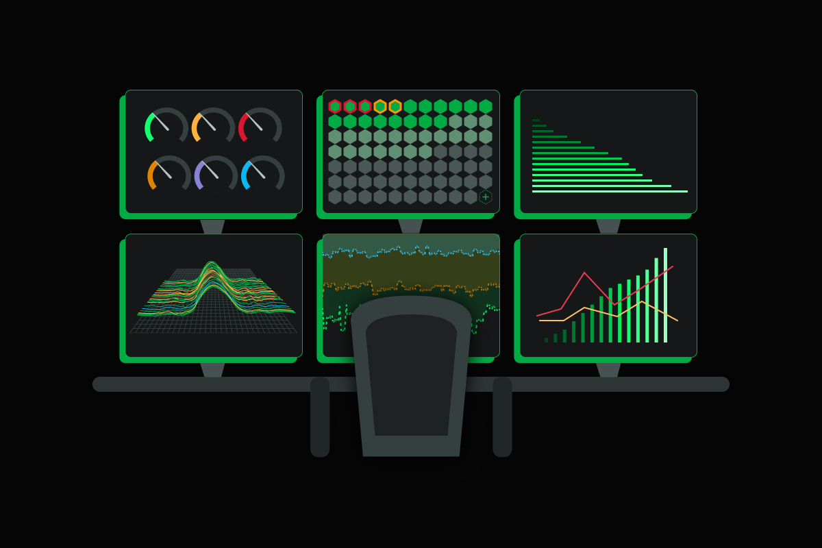
Introduction to Netdata’s new visualisation providing AI Insights, supporting Rapid Diagnostics.

A New Era in Monitoring Systems Dashboards
We’re thrilled to share an important upgrade to Netdata: AI Insights & Rapid Diagnostics, a technology aiming to redefine what we expect from a monitoring system.
Challenges with Traditional Monitoring Dashboards
Traditional monitoring systems rely on a query language to help engineers create dashboards and alerts. While these languages offer power and flexibility, they come with several challenges that make monitoring and troubleshooting more complex and time-consuming:
-
Deep understanding of metrics: Users must have a solid grasp of metrics, their relationships, and their implications. Misinterpretations can lead to incorrect queries and misleading visualizations.
-
Learning curve: Users need to learn the syntax and structure of a query language, and mastering it takes time and experience.
-
Prone to errors: Identifying and correcting errors can be difficult, especially for non-experts.
-
Time-consuming: Crafting complex queries can require significant time and effort, reducing overall productivity.
These challenges become more prominent during troubleshooting. Limited, or even not polished, visualizations hinder problem-solving, forcing teams to develop new or enhance existing dashboards during a production systems crisis - ultimately prolonging mean time to resolution.
Introducing Netdata’s AI Insights & Rapid Diagnostics
Our AI Insights & Rapid Diagnostics solution addresses these challenges, incorporating AI-based anomaly rate detection and the NIDL (Nodes, Instances, Dimensions, and Labels) framework. All these upgrades are supported by a new set of API endpoints, common to both the open-source Netdata Agent and Netdata Cloud.
ML-Based Anomaly Rate Detection
Netdata is training an ML model for every metric collected. Using this model it detects in real-time data collections that are outliers. These anomalies are stored in the Netdata database and are queried in parallel with metric data. We’ve made several updates to showcase the anomaly rates on all charts:
-
A ribbon above the charts displays the aggregated anomaly rate across all dimensions of each chart, enabling users to quickly spot anomalies without any additional action.
-
A small bar below each dimension value in the chart legend shows the anomaly rate for each individual chart dimension in real-time while hovering over the chart.
-
The anomaly rate is now included in the chart popover that appears when hovering over a chart or dimension. The pop-over provides a histogram of the metric values while hovering the chart, which turns into an anomaly rate histogram when hovering the anomaly rate ribbon.
NIDL: Nodes, Instances, Dimensions, and Labels
Our new query engine is now capable of aggregating statistics across all possible views in one go. The new response format includes such statistics for each node, instance, dimension, and label in addition to the chart data:
-
The contribution percentage of each node, instance, dimension and label in the final chart data, used for quickly spotting the volume each node, instance, dimension and label contributes to the visualization.
-
The anomaly rate of each node, instance, dimension and label for the query time-frame.
-
The minimum, average, and maximum values of all points aggregated for each node, instance dimension and label during the query time-frame, revealing the source of dives and spikes in the data set.
These statistics are visualized in drop-down menus above each chart, which also act as filters for the query. With NIDL, users can immediately get insights about different aspects of the query and at the same time filter the query to reveal them in more detail.
Multi-Dimensional Group-By
We’ve added a “Group by” menu on each chart, enabling users to group data by dimension, instance, node, and labels. This multi-select menu allows for multiple groupings simultaneously, empowering users to quickly analyze different aspects of the same dataset and uncover insights that would otherwise be difficult to discover.
Each Netdata chart now becomes a powerful dashboard, capable of quickly, easily, accurately and precisely revealing all aspects of the dataset queried. And this is only the first step of a series of dashboard changes, aiming in providing unparalleled insights and advanced troubleshooting tools for root cause analysis.
In conclusion, Netdata’s AI Insights & Rapid Diagnostics provide a powerful and intuitive solution to the challenges of traditional monitoring systems. With ML-based anomaly rate detection, the NIDL framework, and multi-dimensional group-by capabilities, our solution streamlines monitoring and troubleshooting, making it more efficient and effective than ever before.
Product Talk
Join the Netdata team on the 20th of April, at 16:30 UTC in Discord where we will be unveiling the new visualisation with innovative capabilities, and be the first to get a sneak peek and contribute with your valuable feedback for the team to tweak these features before releasing them to the public.

